Bumble Insight
Helping users reflect, recharge, and date with more intention.
This project redesigns Bumble Insights into a personalized, cross-platform dashboard that blends data visualization, behavior tracking, and mindful nudges to reduce dating app fatigue and promote meaningful engagement.
Product
Mobile app
My role
Product designer (Individual project)
Timeline
4 weeks, Spring 2025
Context
Despite premium features, Bumble users face emotional fatigue due to unstructured, repetitive interactions without meaningful guidance or feedback.
Endless swiping, low return: Users swipe mindlessly with little clarity on what’s working.
Cognitive overload: Constant chatting and decisions create emotional burnout without moments for pause or reflection.
No behavioral insight: Existing insights focus only on profile tips, lacking personalized usage or engagement guidance.

Problem Framing
Burnout and mindless swiping reduce long-term user retention, suppress meaningful matches, and stagnate premium conversion.

Users feel stuck in repetitive behavior loops (“swipe → match → drop-off”) without understanding why they feel fatigued or how to make better decisions.
Research
Literature review insights
A Forbes Health study revealed that 78% of users felt exhausted by dating apps, with Gen Z and Millennials showing the highest burnout rates. Additionally, users spent around 51 minutes daily on these apps—highlighting the urgency for features that promote mindful engagement rather than passive swiping.
Average Time Spent on Dating Apps per Day
Percentage of Users Experiencing Emotional Fatigue
All
Gen Z
Millennials
Gen X
Baby Boomers
User Interviews
To understand what contributes to dating app fatigue and how users engage with Bumble Insights, we conducted 6 in-depth user interviews with current dating app users

Opportunity
Design Concepts
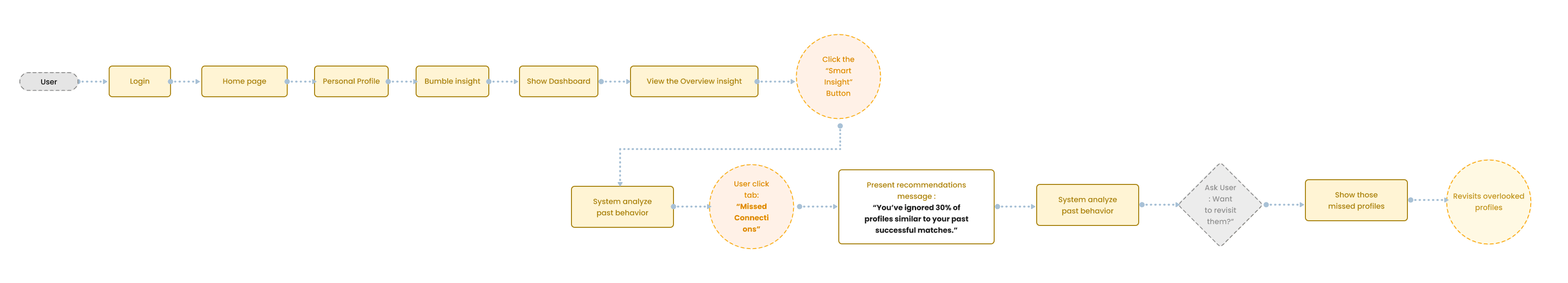
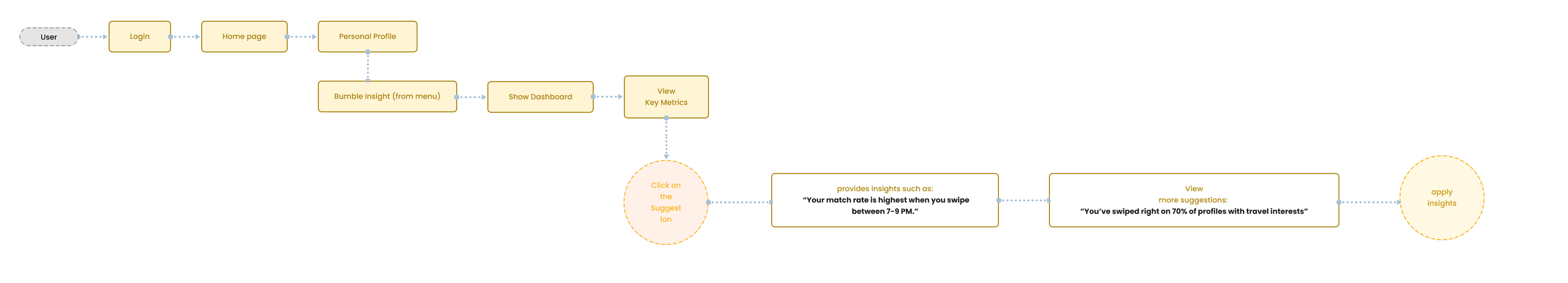
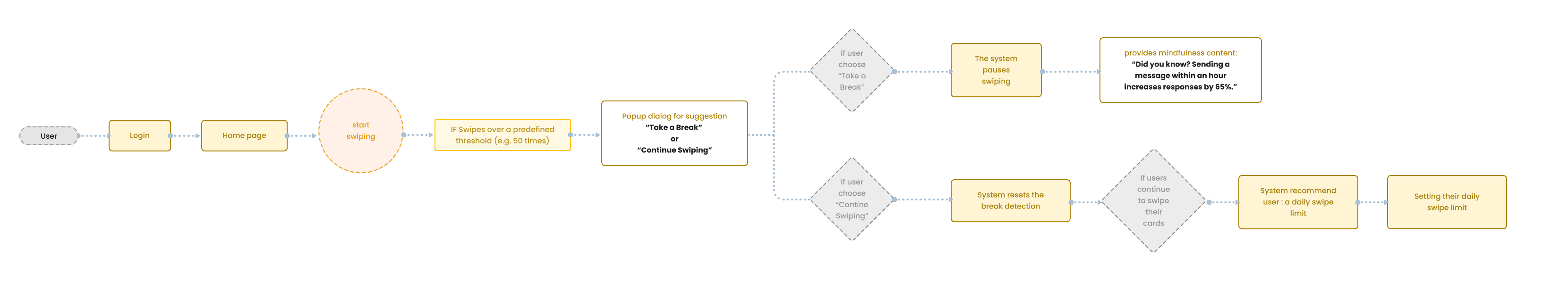
To visualize how users would meaningfully interact with the redesigned insights, I mapped out a detailed logic-based user journey flow.
This user flow was not just an interface plan, but a way to model behavior change through design: understanding when the user receives feedback, what kind of nudges are meaningful, and how the dashboard could adapt over time.
Ideation
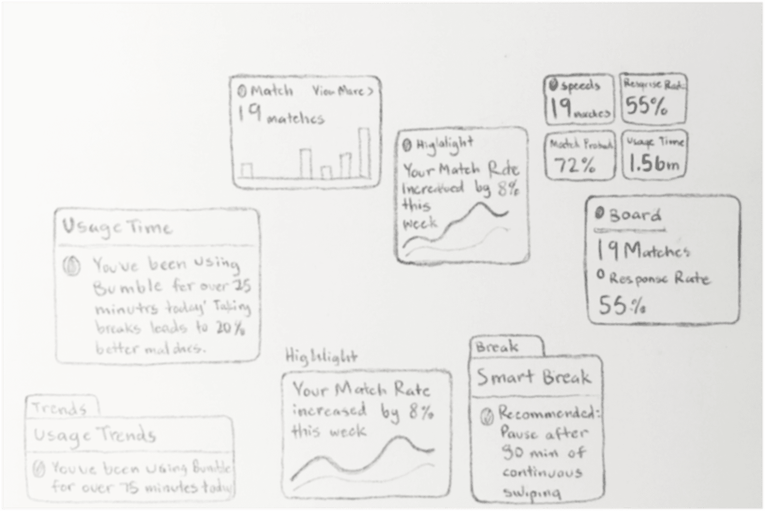
To further explore the concept, I translated ideas into hand-drawn sketches and early UI components.
Each sketch focused on different questions:
How can metrics feel human, not just numerical?
How should cards adapt to different usage states?
Can reminders feel supportive instead of pushy?
While exploring early concepts, I began thinking beyond the main app. What would behavior feedback feel like on wearable devices? Could we make reflection feel more ambient and less intrusive? This led to sketches and early flows for:
Apple Watch: gentle nudges through haptic feedback, quick progress summaries, and emotional check-ins via simple taps
Web dashboards: extended views for users wanting to explore detailed behavioral trends and insights
Mobile-first designs: with progressive disclosure for deeper metrics only when needed
Design Approachs
Across the three concept directions, the strongest path forward was a hybrid strategy that combined the clarity from Direction 1, the wellbeing support from Direction 2, and the personalized guidance from Direction 3. These explorations helped clarify what users truly needed: not more data or restrictions, but a system that transforms behavior signals into insights they can understand, nudges they can act on, and advice that feels emotionally supportive.
With these learnings, I moved into the final design phase with a clear product strategy: build an MVP that makes dating behavior visible, actionable, and emotionally safe — while supporting healthier engagement rather than suppressing it.
Design Iteration
This is where we specifically show how you refined the data visualization logic for usability and emotional engagement. Add a subsection: I iterated several approaches for making match and swipe data feel more human and digestible.
✦ Played with progressive disclosure—letting users opt-in to deeper stats as they scroll
✦ Animated micro-interactions (pulses, fades) to guide attention and reduce cognitive load

Solution
Turning static data into actionable understanding
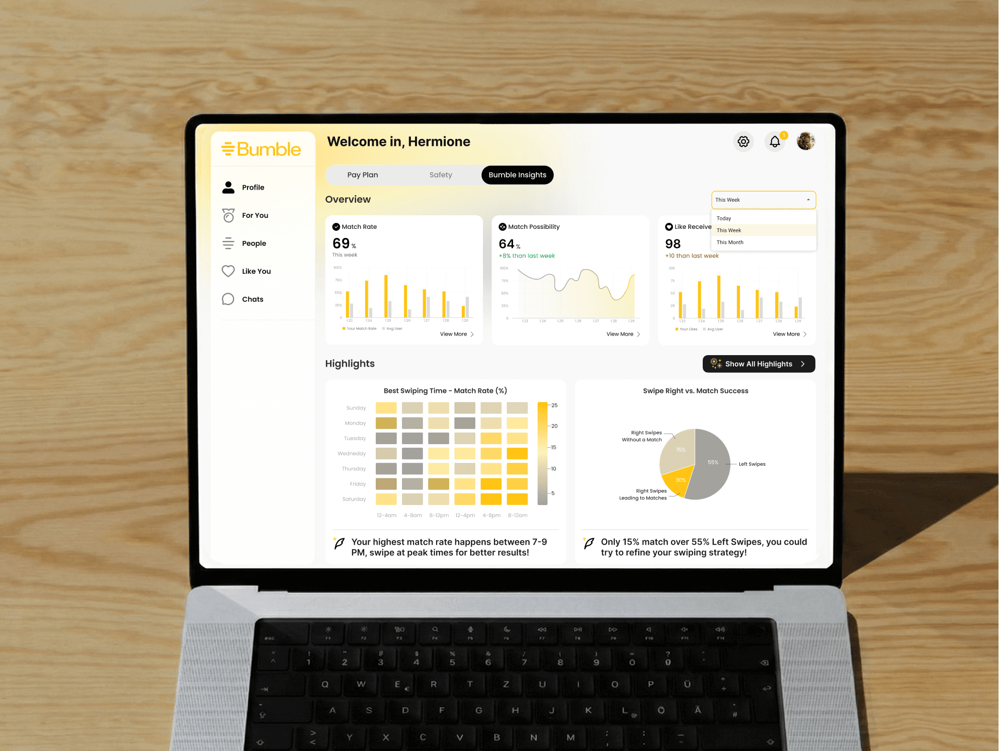
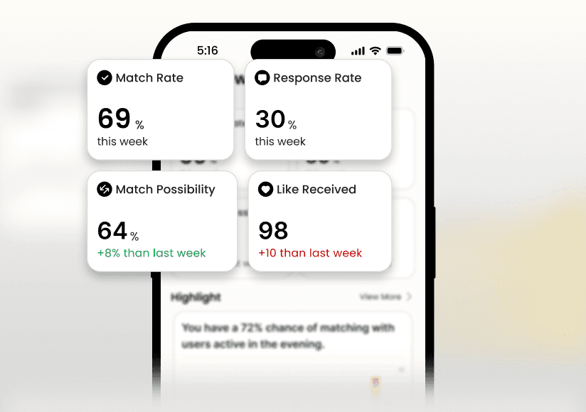
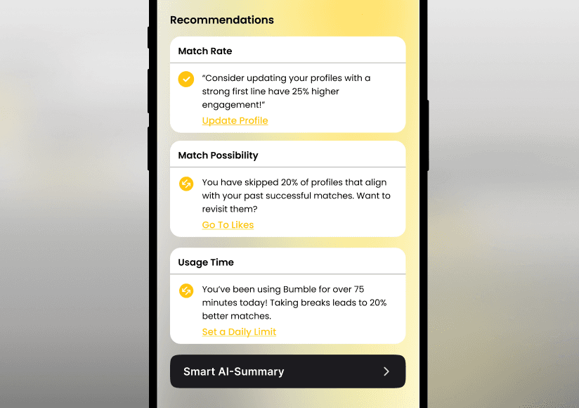
These interactive cards turn raw numbers into simple, animated visuals paired with quick AI-generated highlights.
Purpose: Give users quick, friendly explanations of their patterns so they can learn and adjust easily.
Personalized highlights with clear next actions
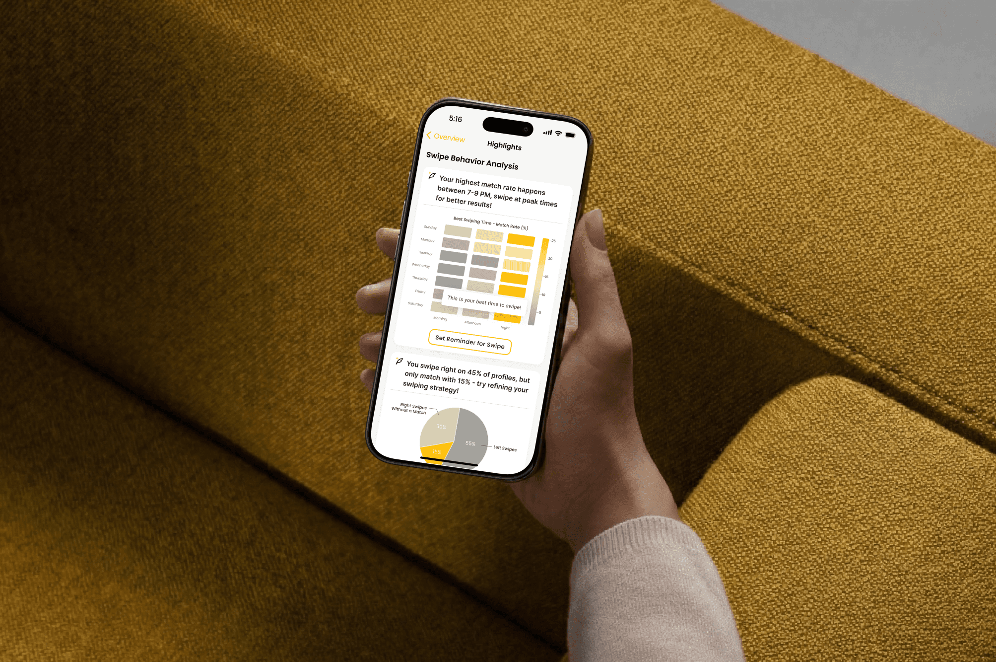
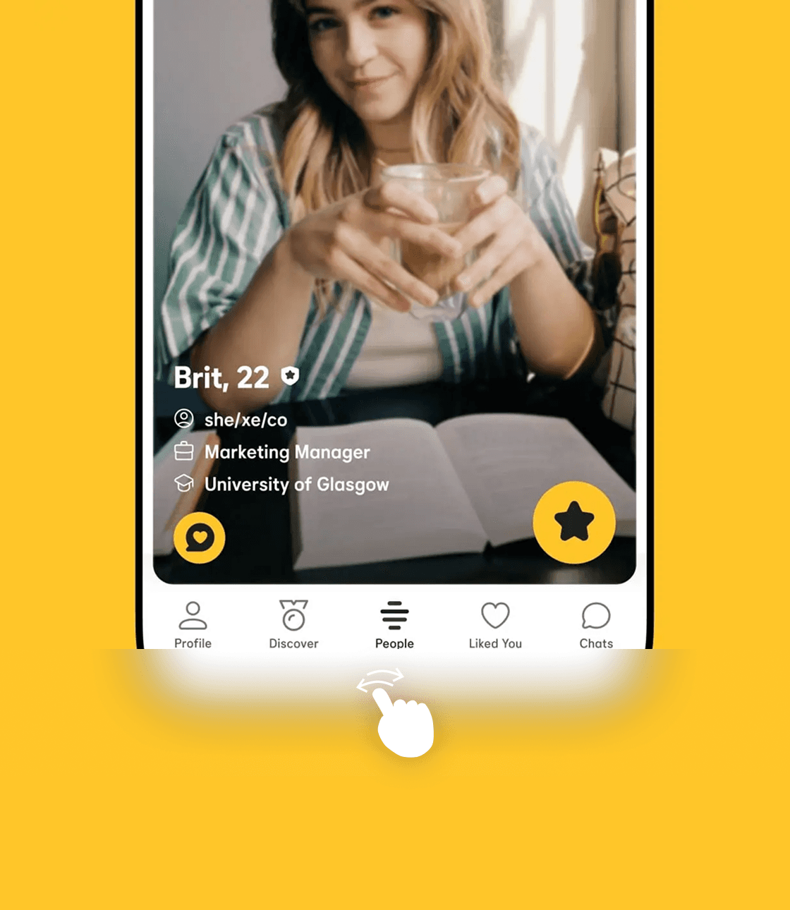
The Highlight section surfaces quick, personalized insights — like your highest match time, your weekly match rate, or swipe-to-match patterns, and pairs them with simple, actionable guidance. Users can immediately act on what they learn, whether that’s setting a reminder to swipe at peak times, revisiting skipped profiles, or reaching out to matches. By connecting behavior patterns to meaningful next actions, Highlights turns passive data into clear, supportive direction.
Purpose: Help users quickly understand their most important dating patterns and guide them toward small, intentional steps that improve their overall experience.
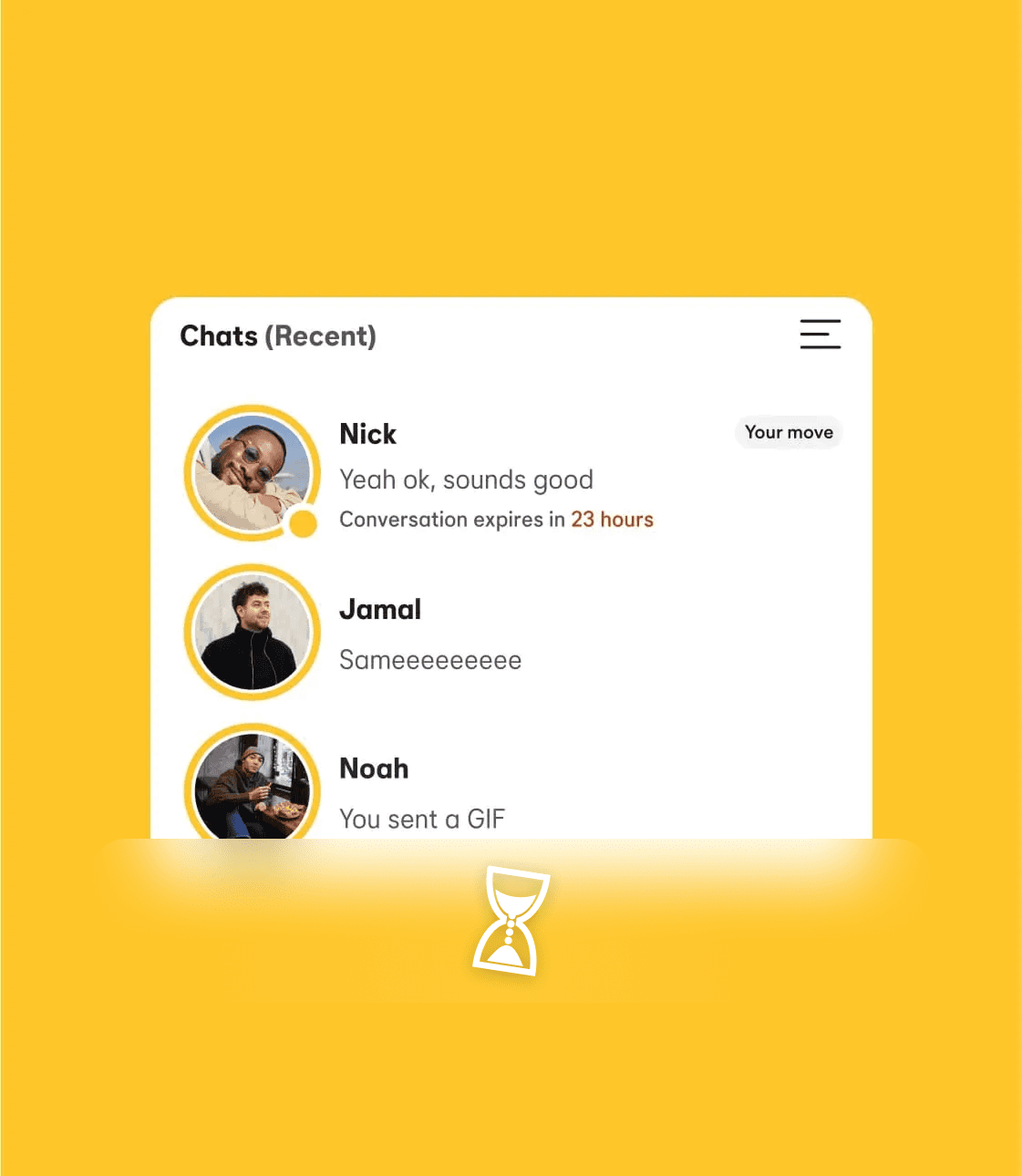
Engagement Pop-Ups
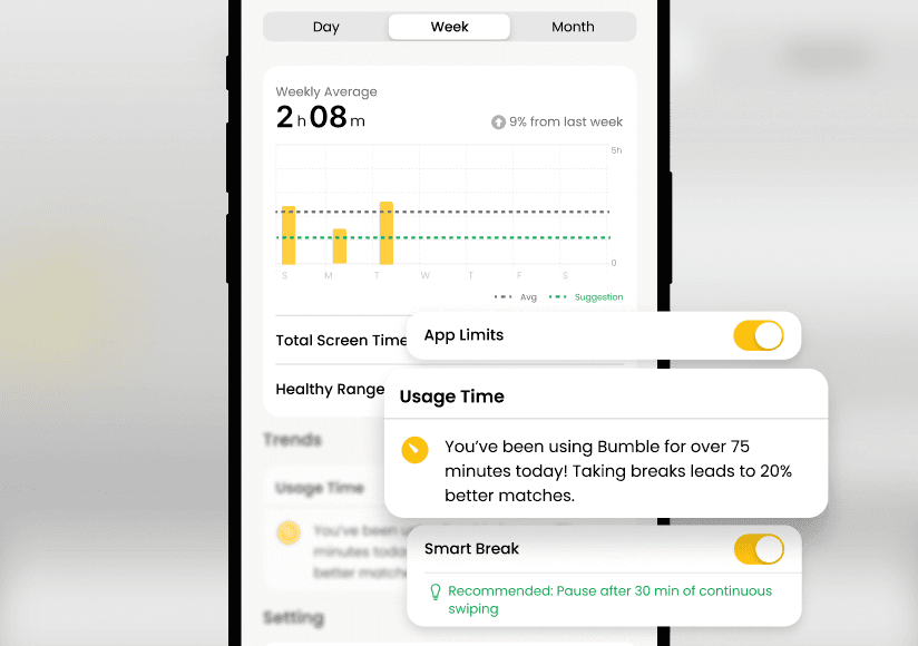
Instead of pushing more swipes, these light pop-ups nudge users toward actions that matter: reaching out to new matches, checking their weekly insights, or taking a short break. They’re minimalist, gentle, and always tied to something genuinely helpful.
Purpose: Keep users engaged in more meaningful ways, not stuck in endless swipe loops.
Mindful Dating Guide
This section blends data with warm, human advice. Users get short bite-sized tips, articles, and suggestions that feel personal and comforting — like a small reminder to slow down, set intentions, or reflect on what’s working.
Purpose: Offer emotional balance and help users date more intentionally, not just more often.
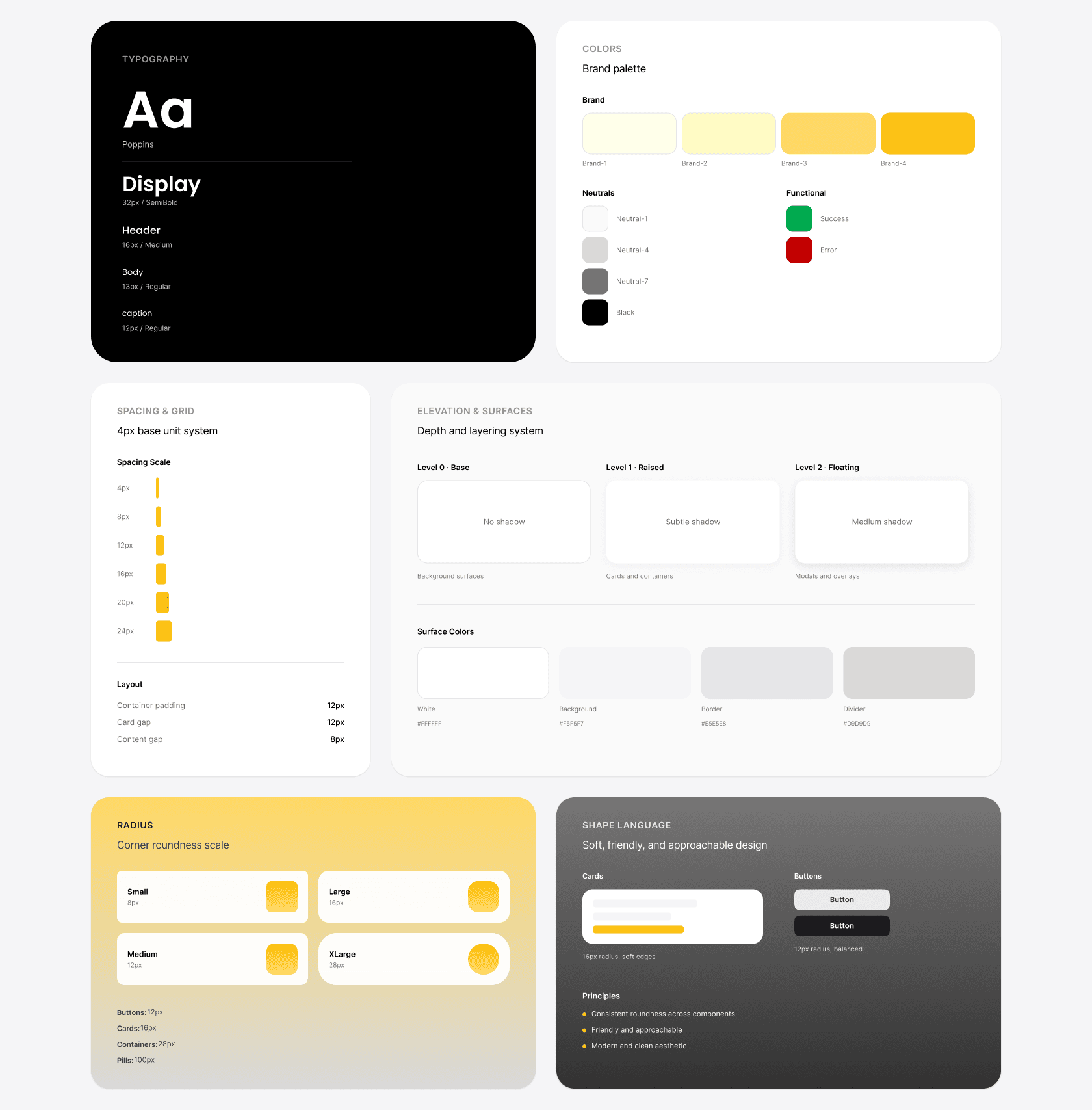
Feature-level design foundation
Because this feature introduces reflective, emotionally sensitive feedback, I established a scoped design foundation to ensure consistency and clarity throughout the experience.
I adapted Bumble’s existing visual language rather than redefining the brand, focusing on typography hierarchy, spacing, and color usage that support calm interpretation of insights.
These foundations were organized into a reusable style library in Figma and applied consistently across the final designs.

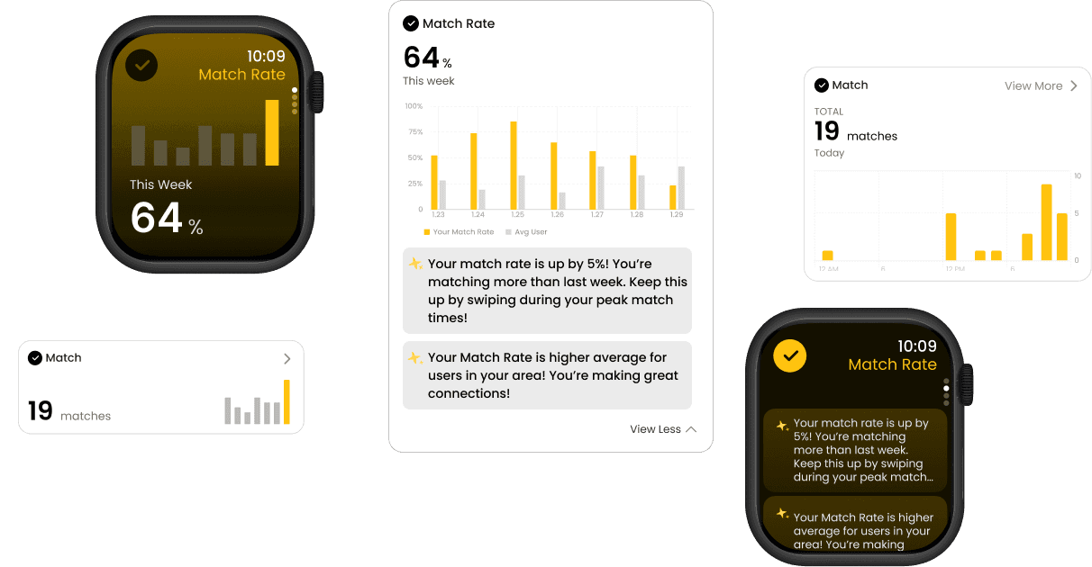
Cross-Platform Adaptation
During the design phase, I wasn’t just creating screens, I was also building a system that could scale across platforms and evolve with future Bumble experiences.
To support dating reflection anytime, anywhere, I designed for:
🖥 Web – Full dashboard experience with rich data visualizations
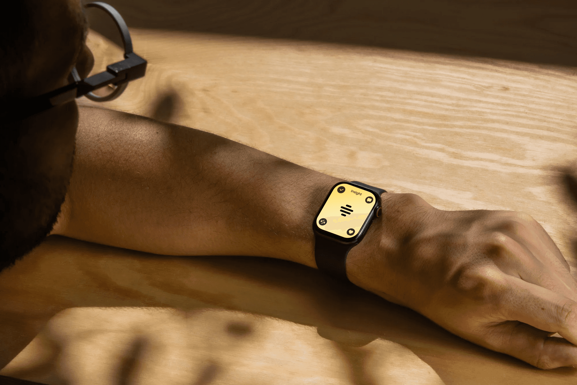
⌚️ Apple Watch – Micro-insights with:
Quick Actions
Progressive Views that stack key data
Mini-reflection prompts for mindful use
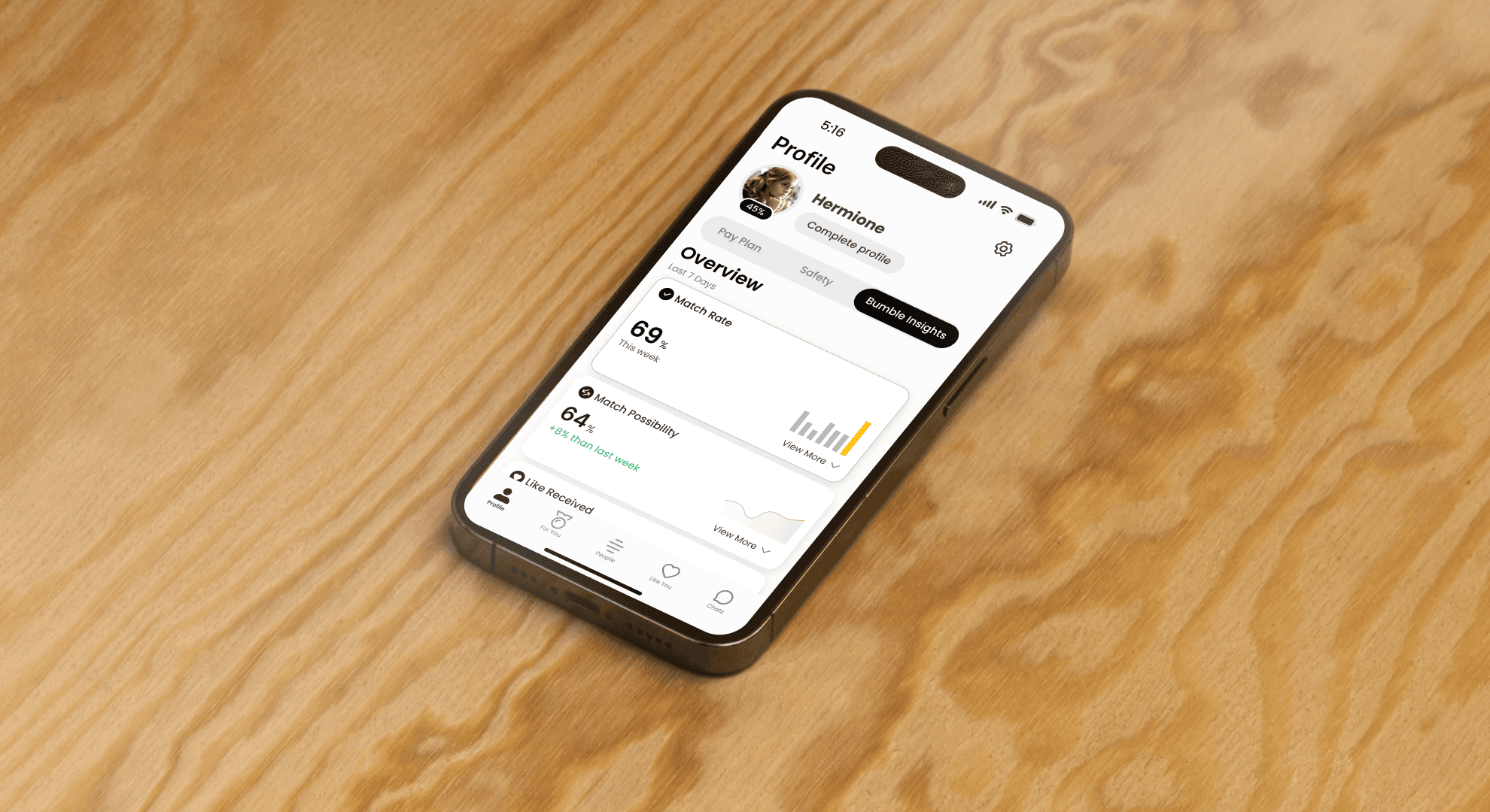
📱 Mobile App (iOS) – Modular cards with contextual CTAs and swipe behavior tracking
These adaptations support data transparency and behavioral continuity across platforms while maintaining Bumble’s emotionally supportive tone.