

I turned a premium brand website from a visually fragmented marketing surface into a scalable decision system that helped users understand the brand, navigate content clearly, and supported the business as ProArt grew.
My role
UX Designer
Company
ASUS
Timeline
Nov 2022 - May 2023
Collaboration
1 Design Manager, 2 UX Researchers, Marketing Team, Brand Team, Product Team, Developers
Start with how people decide, not how things look

Overview
I design systems that help people decide, not just explore

About ProArt
ProArt is ASUS's flagship line for filmmakers, designers, animators, and a broader range of creative professionals who expect precision in the tools they choose. The hardware earned that trust. The website was quietly spending it, not because it looked wrong, but because it wasn't built around how people choose.
Probelm
The site showed products but didn’t help people choose

Why it matter?
For User
Which ProArt product fits my workflow? Which differences actually matter for my use case? Is this premium product worth it for the kind of work I do? Can I trust this tool for professional creative work? None of those questions had a clear answer anywhere on the site.
Design challenge
How do we help users choose with confidence, not just browse with interest?
Reframe
From website redesign to decision system

The site couldn't scale with the brand's growth.

Users found the information structure unclear, the content overwhelming, and the path to a decision invisible.
How do we build a system that is flexible enough to grow with the brand, accessible enough to work for every creator, and clear enough to actually guide a decision?
All three problems had the same root: no shared foundation. Every fix was local. Every improvement was temporary. That is what I was actually there to solve.
Real question
How do we create a system that guides decisions not just displays products?
What to solve first was itself a design decision
Before designing anything, I mapped every identified gap against an impact vs. effort matrix with PM and engineering. The goal was not to do less, it was to sequence work so Phase 1 delivered a stable foundation capable of holding Phase 2, rather than a surface that would require rebuilding in six months.
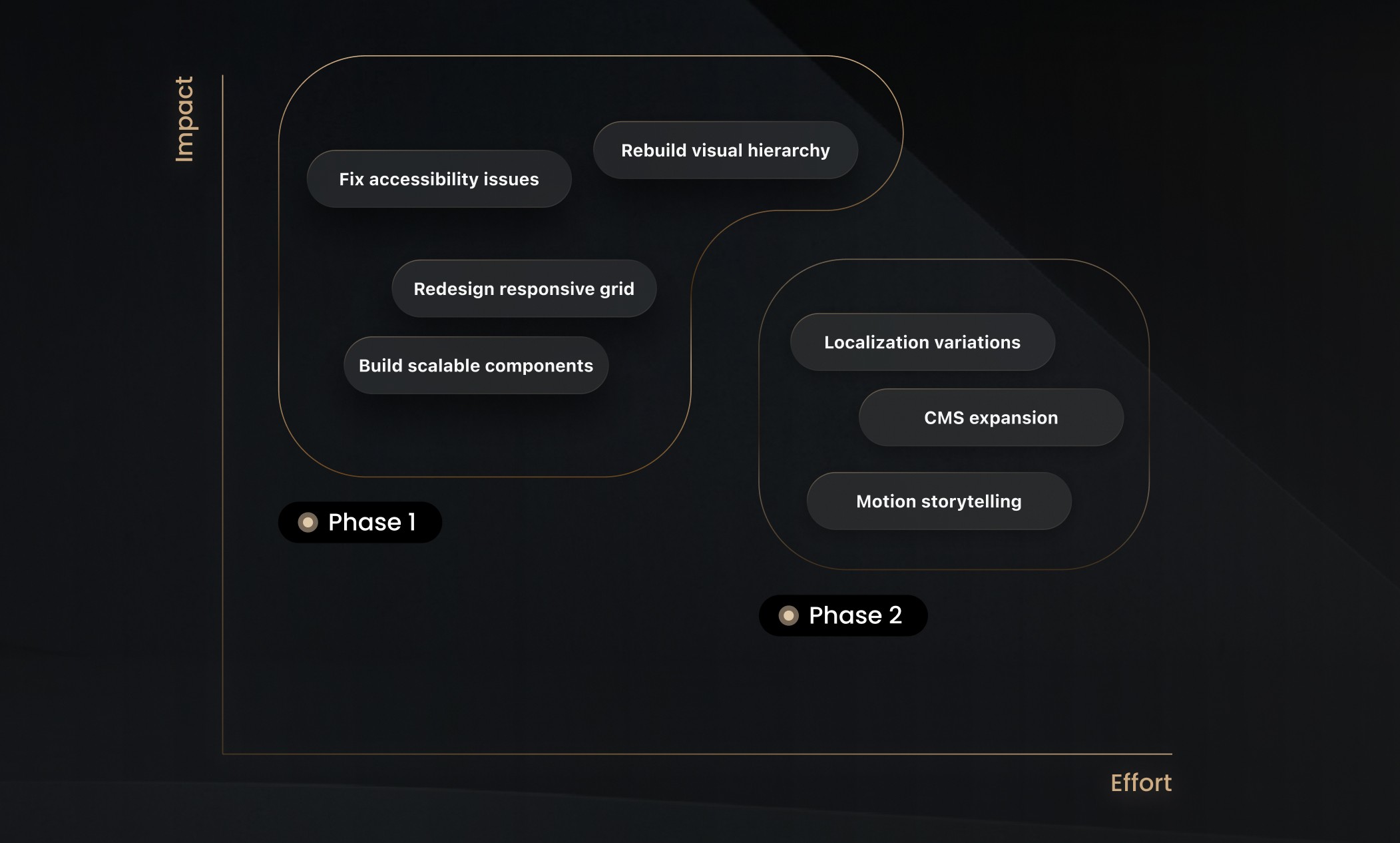
Design Gaps
The structural gaps underneath the surface

Design Execution
Design decisions that supported clearer evaluation


Design Highlight
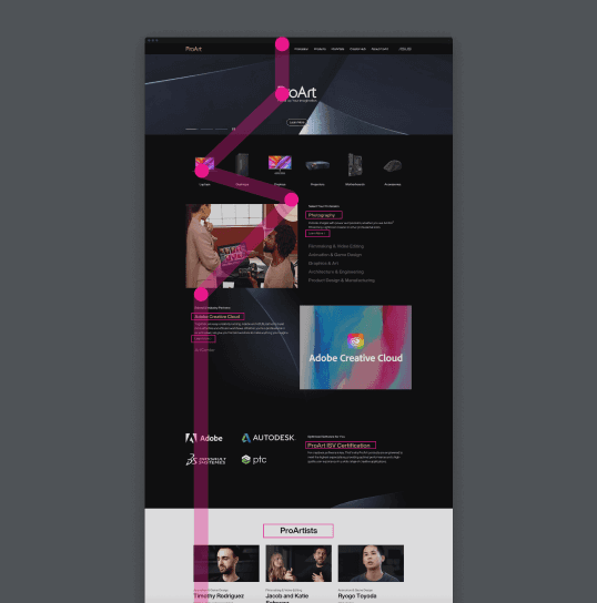
New page, new storytelling
As ProArt's creator partnerships grew, a structural gap became undeniable. Creators don't just trust brands. They trust other creators who have already made the decision they're considering. Peer validation isn't a nice feature. It is the signal that gives people permission to commit.
The existing site had no space for it. No creator voices. No craft context. Just specs and product photography. So I designed "What Pro Says" as a dedicated storytelling hub, and artists speak directly to the people evaluating the same tools.

This page could not have existed in the old architecture. It only became possible because the system was built to support a new kind of page.
I focused on two critical areas: the Hero section and the Gallery section. These sections worked to inspire users while boosting engagement, anchoring the storytelling approach of the page.

I tested three layout directions with marketing, brand, engineering, and QA. Layout C was chosen because it held the widest range of creator stories without visual clutter, performed smoothly across lower-end devices, and was built for modular CMS extension as new partnerships came in.


Users’ Perspective
"The carousel is interactive and includes detailed information, which works well to engage users."
Our TA

Design System
Building a reusable foundation for scale
The goal wasn't just consistency. It was to make clear, trustworthy patterns reusable so future pages could scale without recreating the same decision problems. Not a side deliverable. The foundation every future page builds from.

Balancing brand, content, and engineering constraints
Cross-functional alignment was part of the design work. The system only succeeded because it balanced marketing flexibility, engineering constraints, brand requirements, and user clarity at the same time.


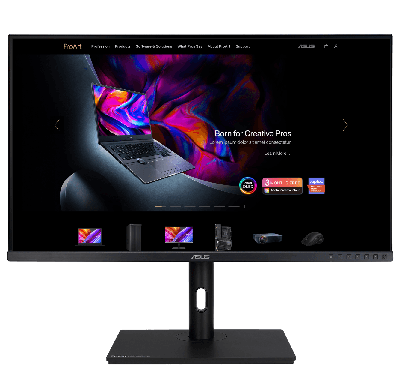
Final Design
The shipped experience
The final ProArt website unifies clarity, accessibility, and premium brand expression into one coherent, scalable system. Every key page was rebuilt using consistent hierarchy, accessible color rules, and a flexible component library. The result is a digital presence that reflects the same standard as the hardware.
Impact
Making the site easier to trust, navigate, and grow
Faster launches, stronger brand coherence, and a foundation built to hold as the product line keeps expanding.
For User
Creators can now move from curiosity to confident decision. The path exists. It didn't before.
For the business
Campaign pages that once required bespoke engineering ship from existing components. The brand scales without rebuilding.
For the business
Teams chose to use the design system without being asked. That is the only real proof it worked.

Reflection
What I learned about designing for decisions
When users struggle to choose, the problem is rarely missing information. It is missing structure. That is what ProArt taught me and it is the lens I bring to every project since.


