Skip to content
ASUS · Design Systems

Built the web design system every new ASUS site starts from

Owned ASUS's web design system from audit to rollout, scoped for adoption over completeness. Design-discrepancy tickets fell ~60% across the two tracked categories combined, and brand compliance rose from ~60% to ~95% within six months.

Product
Web Platform Design System
My role
UI Designer & Design System Architect
Timeline
Q3 2021–Q4 2022
Team
DMURD1
+1
TL;DR

Every team rebuilt the same UI.

Over 18 months, from audit to rollout: I set the foundations and token strategy, scoped the first release for adoption over completeness, and made the system the default start for new ASUS web projects.

The problem

Duplicated work

Global and regional teams rebuilt buttons, forms, and navigation on every project.

The solution

Adoptable over complete

Shipped the high-frequency patterns teams rebuilt most, strict on foundations and loose on composition, so regions adopted it instead of forking it.

What I owned

Core contributor

Foundations, token strategy, component specs, and documentation, with two designers on production.

Key outcome

60→95%

Brand compliance rose from ~60% to ~95% on the brand team's audit checklist.

Problem

Same product. Different UI every time.

ASUS was scaling web experiences across global and regional teams. UI patterns diverged because every project started from a blank file. Each launch added design debt: duplicated specs, inconsistent QA, and regional sites that looked like different brands.

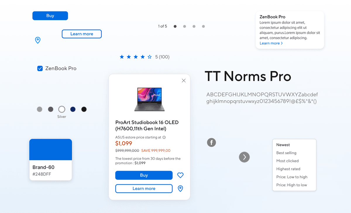
After the system: the same product card rebuilt on TT Norms Pro with system buttons, tokens, and type scale.
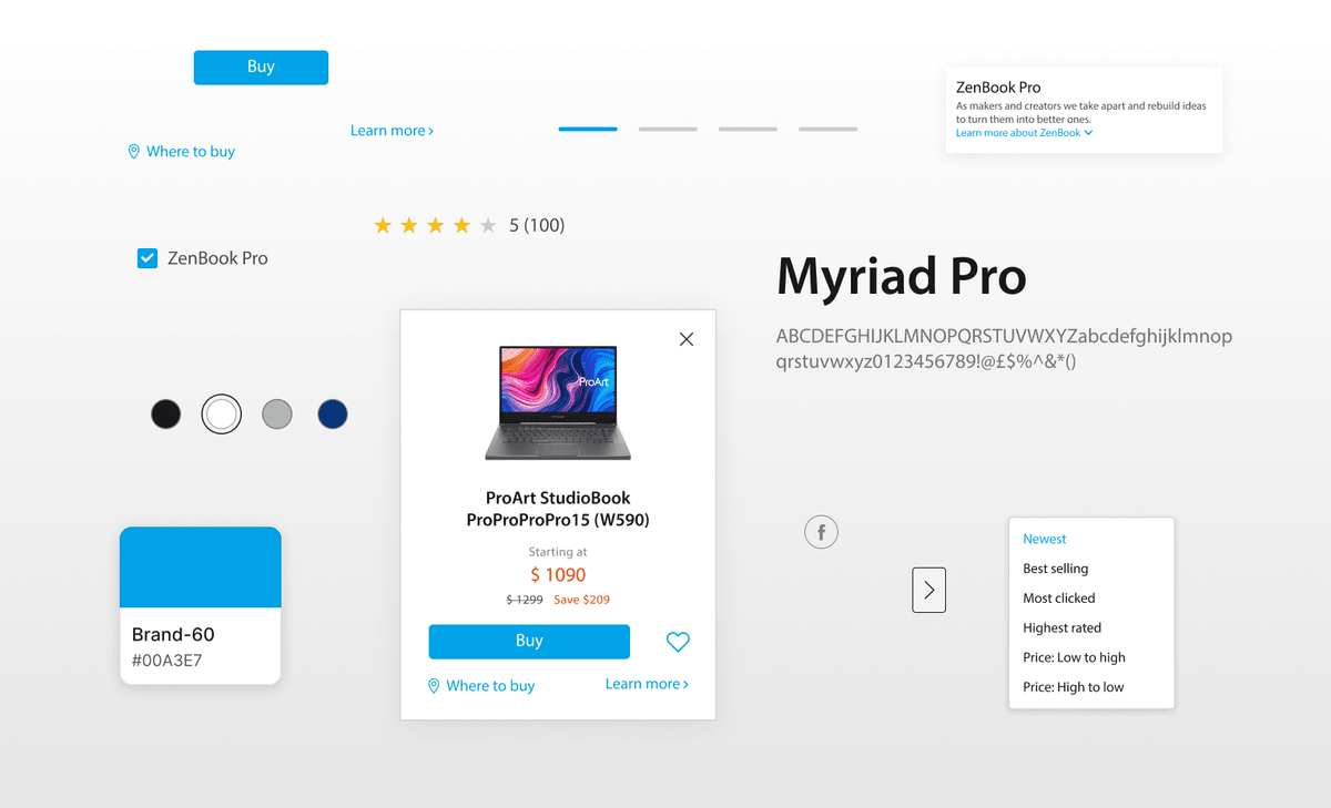
Before the system: the same product card in the old Myriad Pro styling, with inconsistent buttons, pricing, and type.
Before the systemAfter the system

Before the system: Before the system: the same product card in the old Myriad Pro styling, with inconsistent buttons, pricing, and type.. After the system: After the system: the same product card rebuilt on TT Norms Pro with system buttons, tokens, and type scale..

Stakeholders

One system, many priorities.

Design team

Reuse, not redraw. Components shared across regions instead of rebuilt for every launch.

Engineering

Build without guessing. Specs and tokens precise enough to implement straight from the doc.

Design leadership

One brand, everywhere. Global and regional sites that read as the same company.

Product managers

Ship sooner. Pages assembled from the system, not built from scratch.

Research & reframe

Perfect system or adoptable system?

The audit showed duplicated components and inconsistent styles, but also why: regional teams had real constraints in markets, launch calendars, and fonts. They did not need a complete library. They needed high-frequency patterns they could ship: strict where consistency mattered, flexible where regions differed.

The shift was not more components. It was stricter foundations, looser composition.

Old question

How do we standardize every component across every product?

Real question

What must be identical everywhere, and where do regional teams keep the freedom they actually need?

Key insight. Strict foundations, flexible composition. Otherwise the regions fork the system and we lose them.

My role

What I owned and what was shared.

I owned foundations, token strategy, component specifications, the documentation framework, and the governance model that kept teams on the system as it grew. Two other designers built component production and authored docs against the standards I set. Three designers, one shared source of truth.

The solution

From audit to rollout.

01

Audit & discovery

With UX research, I documented layout, type, color, spacing, and component drift across live ASUS sites in a dedicated Figma file. The findings became the scope list for v1.

02

High-frequency first

Buttons, forms, navigation, and the core type and color rules: the patterns teams rebuilt most. Scope was deliberately constrained so the first release was adoptable, not exhaustive.

03

Shared baselines

Color, typography, spacing, and grid. Stricter foundation rules with flexible composition on top.

04

Core web components

Structure, states, and responsive behavior built from real usage across ASUS products.

05

Specs teams could use

Notion docs with design intent, variants, tokens, and accessibility specs. The reference engineering built against.

Design details

Nineteen variants became three.

Buttons were the highest-frequency inconsistency: six heights, no clear hierarchy, and many variants failed contrast.

01

Button system

Problem. 19 variants across six unnamed heights, with no shared hierarchy and no consistent touch targets.

Solution. Reduced to three variants (primary, secondary, CTA) and three named sizes (small, medium, large), with CTA reserved for the single conversion action per page.
02

Accessibility

Problem. Contrast failures across light and dark themes.

Solution. Every variant validated for WCAG 2.1 AA, with the passing foreground/background pairings documented as rules.

Design decisions

Three decisions that held the system together.

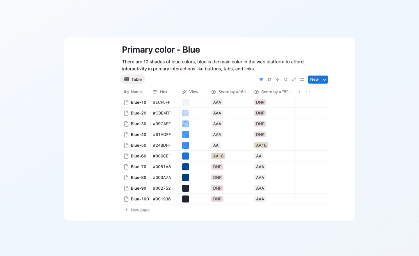
Primary blue scale: ten shades, each labeled with its use case and text-contrast guidance.
The hard part

Standardize hard, then earn adoption.

A good call only counts if teams adopt it. So I ran rollout like a product launch: a workshop before each release, a changelog with every change, and versioned docs teams could trust.

/ 01

Too much

Force one component everywhere and regions fork it. System on paper, drift in production.

/ 02

Too little

Leave every variation and nothing consolidates. The blank file returns.

/ 03

The call

Tokens, type, color, and core components locked everywhere. Layout and composition stayed regional.

Final design

What shipped in the system.

Foundations, components, and documentation that became the default starting point for new ASUS web projects. Later launches, including the ProArt creator line, shipped from these shared foundations instead of one-off rebuilds.

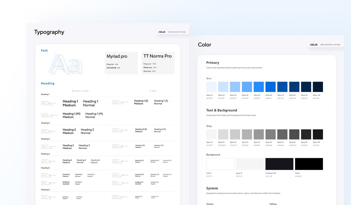
Typography and color foundation spec sheets.
Typography & color
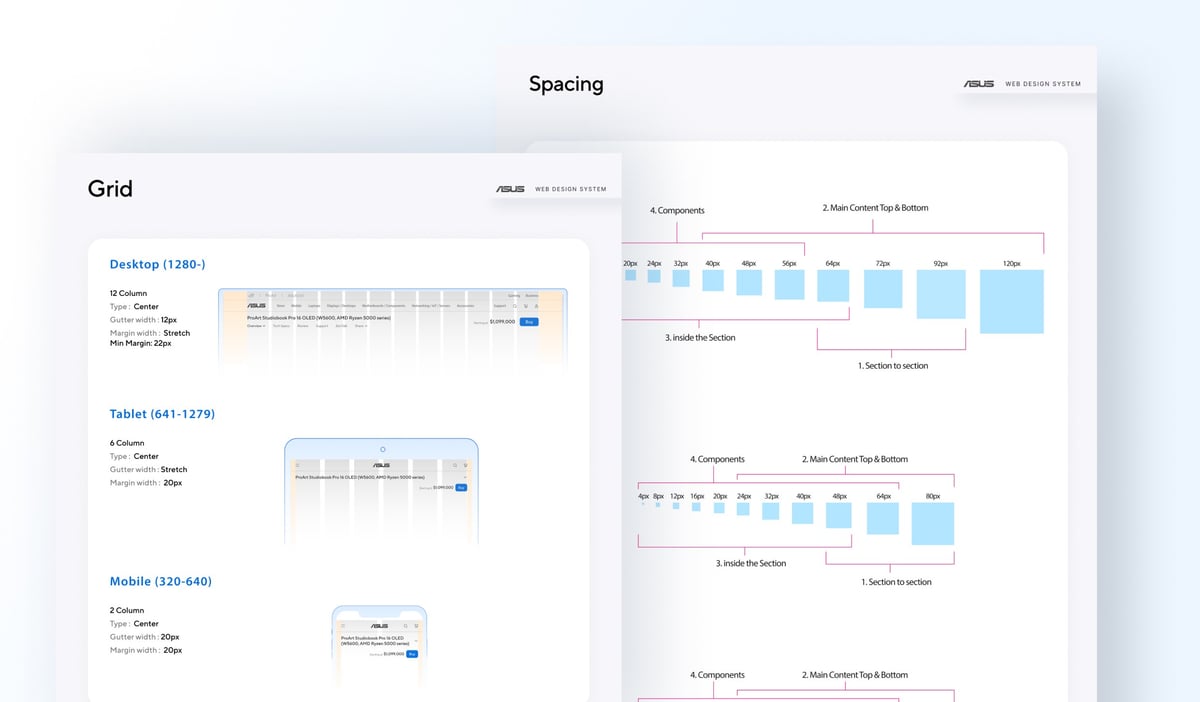
Spacing and grid foundation spec sheets.
Spacing & grid
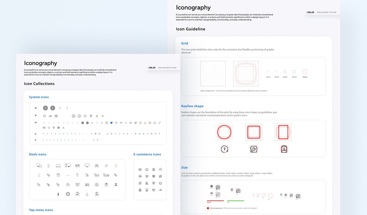
Iconography foundation spec sheets.
Iconography
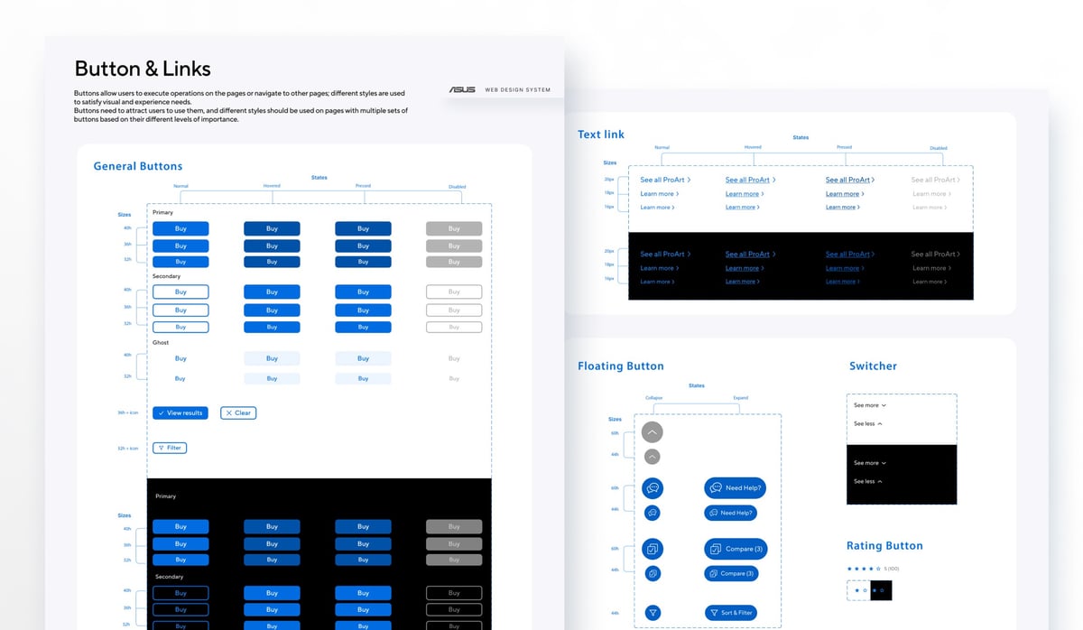
Button and links spec sheets.
Buttons & links
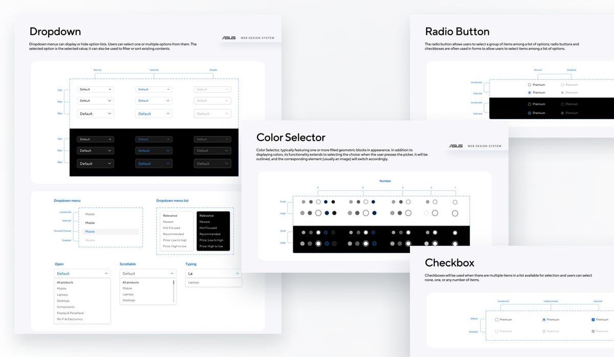
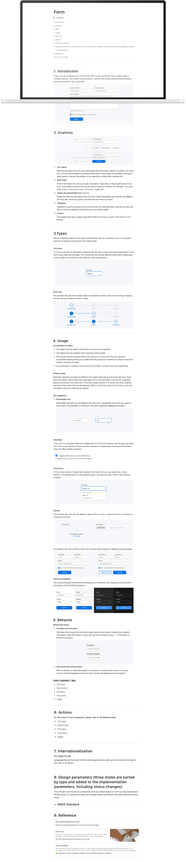
Form component spec sheets.
Form components
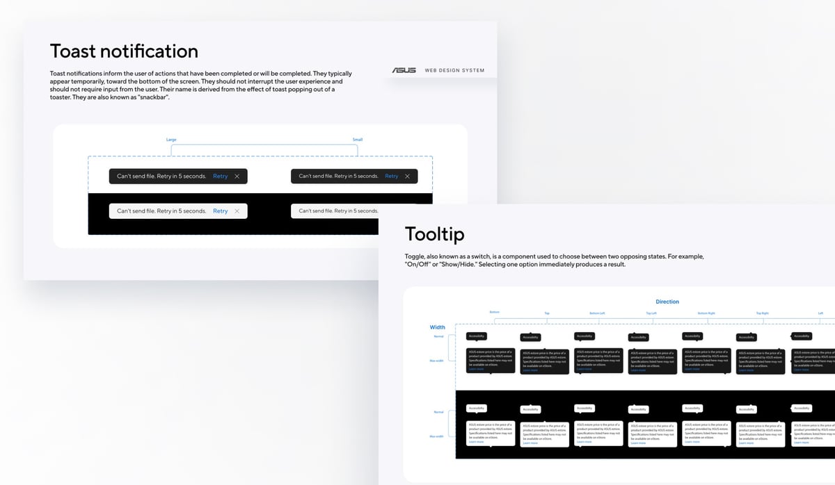
Toast and tooltip spec sheets.
Toast & tooltip
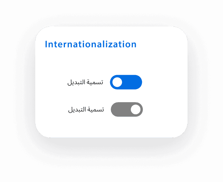
Component shown in left-to-right and right-to-left layouts with mirrored spacing.
i18n & RTL
Full documentation page with developer reference.
Documentation
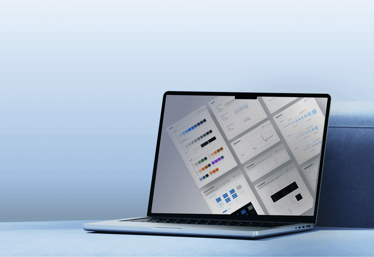
Design system documentation open in a real workspace setting.
Delivery
Impact

What changed after adoption.

Measured six months after v1 rollout against the pre-system baseline, from Jira ticket counts, the brand team's audit checklist, and WCAG audits.

/ 01

~0%

Fewer visual-inconsistency tickets

/ 02

60→60%

Brand compliance

/ 03

~0%

Fewer handoff-mismatch tickets

/ 04

~0%

Fewer WCAG violations

Reflection

Adoption matters as much as the system.