
ASUS Web Design System

I designed and scaled a web design system to reduce UI inconsistency, improve accessibility, and eliminate duplicated design work across ASUS’s global and regional web teams.
Impact: −60% inconsistency tickets · +35% brand compliance · −65% WCAG AA violations
Product
Web Platform Design System
My role
UI Designer & Design System Architect
Timeline
Q3 2021 - Q4 2022
Team
1 Design Manager, 1 UX Researcher, 2 Designer
Tools
Figma · Miro · Design Tokens · Documentation System

Project Context
Between 2021–2022, ASUS was scaling its digital ecosystem across web, mobile, desktop, and platform experiences, while also maintaining global and localized regional sites. As multiple teams designed in parallel, UI patterns, visual language, and interaction behaviors increasingly diverged across products and markets.
To address growing inconsistency and long-term maintenance challenges, ASUS initiated a cross-department design system effort, bringing together brand, product, and platform teams to realign on a shared visual foundation and support future growth.
As a UX/UI Designer on the Web Design Team, I joined the project during its early phase and became one of the key contributors responsible for building and maintaining the web design system, ensuring alignment with the broader brand system while creating scalable, reusable components and documentation for the web platform.
Reframing the Problem
Problem Statement
As ASUS’s web products scaled across regions, teams repeatedly rebuilt similar UI patterns, leading to inconsistency, accessibility gaps, and growing maintenance cost.
Why It mattered
Without clear guidelines, reusable components, and ownership, design decisions were recreated project by project, making consistency and long-term maintenance difficult as the ecosystem scaled.
Design Opportunity
How Might We
Stakeholders
Who needed this: The design system needed to serve multiple audiences with different priorities.
Design Team
(30+ designers across web, mobile, product):
Needed efficient, reusable components to speed up their workflow
Engineering Teams
Wanted clear specifications and reduced implementation ambiguity
Design Leadership
Required brand consistency and quality control at scale
Product Managers
Needed faster time to market for new features across business units
My Role
When I joined the team, the design system initiative had just started. I quickly became a key contributor helping turn abstract alignment discussions into concrete, usable system artifacts.
Responsible for:


Audit & Discovery
We began with a review of existing ASUS websites. Together with UX researchers, we examined layout structure, typography, color usage, spacing, and component behavior. The audit revealed duplicated components, inconsistent spacing rules, and multiple text styles used for similar purposes. These findings helped identify where a shared system would have the most impact.
How I Documented Everything?
Take the spacing for example, I created a dedicated Figma file organizing all findings.


Prioritization
Based on the audit findings, I worked with designers and stakeholders to prioritize areas that would deliver the most impact. Rather than attempting to standardize everything at once, we focused on high-frequency components and foundational elements that could immediately reduce duplicated work. Scope was intentionally constrained to ensure feasibility, alignment with brand direction, and early adoption by both design and engineering teams.

Design Foundations
We established shared foundations for color, typography, spacing, and grid to create a consistent baseline across products.
Decision: Enforce stricter rules at the foundation level while allowing flexibility in component composition.
Trade-off: Required more upfront alignment, but prevented long-term system fragmentation.

Component Design
Using the established foundations, I designed a set of core web components with clearly defined structure, interaction states, and responsive behavior. Each component was built around real usage scenarios observed across ASUS web products, balancing flexibility with consistency. This approach allowed teams to reuse components confidently without reinterpreting patterns for each project.
Pattern Analysis: Reviewed all existing variations to identify common patterns
Variant Consolidation: Reduced variations to essential hierarchy levels
Property Definition: Defined states, sizes, and configuration options
Figma Implementation: Built with variants, properties, and auto-layout features
Usage Guidelines: Documented when to use each variant

Component Deep Dive
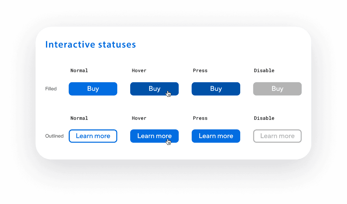
— Buttons
Before we started, there were 19 different button variations across properties. We found 6 different heights with no clear sizing system. Visual hierarchy was unclear. Disabled and loading states had no standardization. Many buttons failed accessibility contrast requirements.
Design Approach :
Reduced buttons to 3 core variants, each representing a different level of hierarchy and emphasis
Another important aspect was standardizing size naming and behavior. We clearly defined button sizes as small, medium, and large to ensure consistency across layouts.
Paid close attention to accessibility and dark mode support, ensuring that each button variant maintains proper contrast, legibility, and usability across themes.

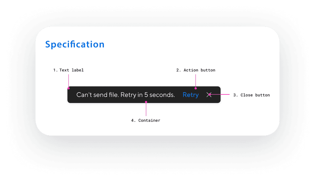
Documentation
Created Notion specs for each component including overview and design intent, variants and states, usage guidelines, do's and don'ts, anatomy diagrams, design tokens for developers, accessibility specs, and before/after examples.
Documentation Philosophy:
Reduce ambiguity, not add rules for the sake of rules
Explain why decisions exist, not just what to use
Make correct usage the easiest path for designers and engineers


Design Decisions
1 - Defining a primary color system
Rationale:
ASUS’s primary blue functioned as both a brand identifier and the most frequently used UI color. Without clear rules, it was applied inconsistently across components, modes, and backgrounds, often leading to contrast and hierarchy issues. To address this, we defined a structured blue color scale, mapped each shade to specific use cases, and validated all color pairings against WCAG standards. This allowed the primary color to remain brand-forward while behaving predictably and accessibly across the system.
We defined a 10-shade blue color scale and mapped each shade to specific use cases, validating all text and component pairings against WCAG 2.1 AA contrast requirements.
Trade-off:
This decision reduced flexibility in how brand color could be applied decoratively and required teams to follow stricter usage guidelines. However, it significantly improved consistency, accessibility, and confidence in using the primary color across different contexts.


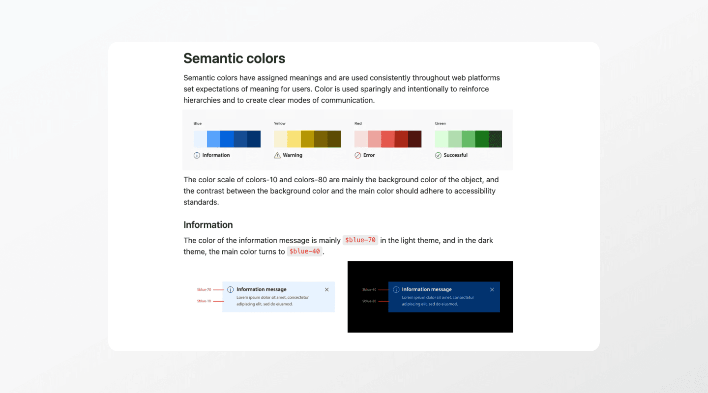
2 - Semantic color tokens
Rationale:
We redefined the color system around semantic intent rather than appearance, introducing tokens such as information, success, warning, and error. This approach prioritized meaning and clarity, ensuring components communicated intent consistently.
Trade-off:
Adopting semantic tokens required upfront alignment and education across teams and added initial complexity to the system setup.


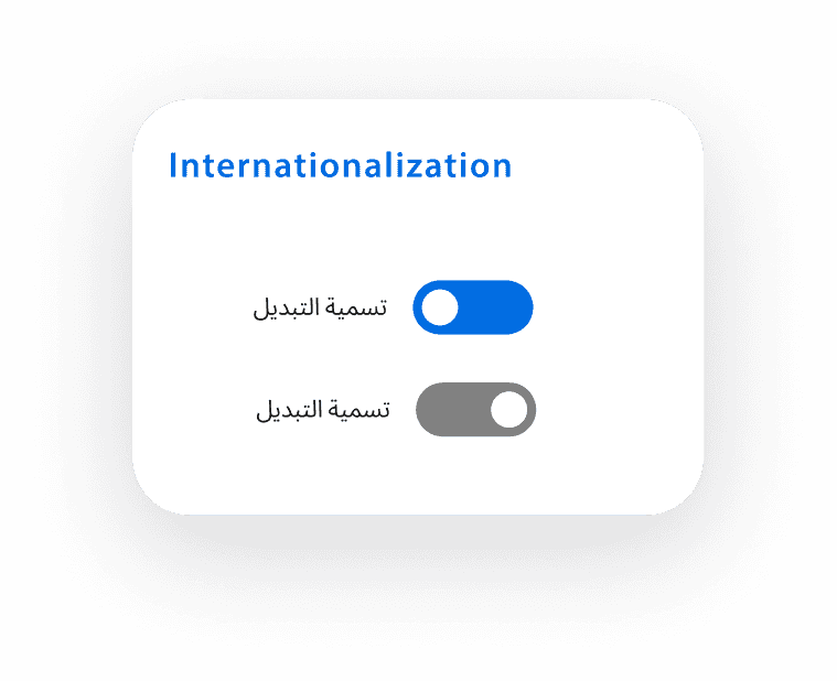
3 - Global typography with regional flexibility
Rationale:
ASUS operates across global and regional markets where typography requirements vary by language, script, and platform support. A single fixed typeface could not realistically serve all use cases. To address this, we defined a scalable typography structure that established a clear font order: a primary global typeface, supported secondary fonts, and documented fallback and substitution rules when the main font was not supported locally. This ensured consistent hierarchy and behavior while allowing typography to adapt to real regional and language constraints.
Trade-off:
Providing multiple font options and fallback rules introduced additional complexity and required closer alignment with engineering. However, this approach prevented layout breakage, preserved readability across languages, and allowed the system to support internationalization without fragmenting visual structure.


Collaboration and Maintenance
As the system rolled out, the challenge shifted from building components to keeping the system aligned as teams moved at different speeds and regional needs emerged. Without clear ownership, it would have been easy for patterns to drift through overrides or one-off solutions.
I worked closely with other design teams and the brand team to maintain consistency across product and marketing experiences, and regularly synced through design reviews and workshops. I partnered with engineers to validate feasibility and implementation details, and collaborated closely within the web design team and with design leadership to align on priorities and updates. System changes were documented, tracked through change logs, and reviewed to keep documentation and implementation in sync. Ongoing maintenance required continuous ownership, not a one-time delivery.
Design System Update
20 May
Updated
19 May
Added
18 May
In Progress
Outcomes
The design system reduced repeated design work by enabling teams to reuse core components instead of redesigning them from scratch. Consistency improved across global and regional web platforms, and collaboration with engineering became more efficient through clearer specifications and shared terminology. Over time, the system became the default starting point for new web projects, supporting faster iteration and more sustainable design decisions as the ecosystem scaled.


Impacts
Design inconsistency tickets dropped by ~60%
By standardizing high-frequency components first (buttons, forms, navigation), teams no longer needed to redesign common UI patterns from scratch.Brand compliance increased from ~60% to ~95%
A shared foundation for typography, color, and spacing reduced visual drift between global and regional teams while still allowing localized content flexibility.Visual discrepancy support tickets decreased by ~40%
Clear component specifications and usage guidelines made UI behavior more predictable across products, reducing back-and-forth between designers, engineers, and QA.WCAG AA violations were reduced by ~65%
Accessibility was embedded directly into core components rather than treated as a downstream QA step.

Reflection
Working on this design system reinforced that progress in a large organization often comes from making incremental improvements that teams can realistically adopt, rather than designing a theoretically perfect system. Because our work lived within a single web design team inside a much larger corporation, alignment and adoption mattered as much as the system itself.
If I were to approach this again, I would spend more time aligning earlier with partner teams on expectations and rollout, especially around how and when teams could transition to shared components. Over time, I learned that clear constraints, practical rules, and ongoing ownership were more effective than completeness. This experience shaped how I approach system design today, focusing on decisions that scale through real usage, collaboration, and sustained maintenance.
